Redesign of the MPN trade finance platforms
The Marco Polo Network is an award-winning trade finance platform that digitizes and transforms supply chain transactions, payments, and financing. I was involved in overhauling the experience of the various business solutions used by top European banks and their corporate partners.
As a Senior Product Designer, I partnered with a fellow senior designer to build a flexible, scalable atomic design system, working closely with the front-end development team and the CX manager to roll it out across all four business modules.
What I worked on
Co-built MPN's atomic Figma design system and redesigned core trade finance flows across 4 modules after the TradeIX rebrand.
Results
4.4/5 user satisfaction rating
Consistent customer experience in all 4 business modules
60% faster design & development
Timeline
August 2021 - February 2022 | 7 months

Overview
As part of the Design Team, I co-led the build of a powerful, flexible, and detailed Design System. In early 2022, the company rebranded from ‘TradeIX’ to ‘Marco Polo Network’. We needed to rebuild our products and platforms aligned with the new branding. Also, after using the old design system we built almost 2 years ago, we felt that that was the right time to get rid of the limitations it had. Also, Figma’s advanced and powerful features give more flexibility to build and maintain a design system, so we wanted to take the opportunity to go with a completely new design system.
We completed the project in 7 months, significantly improving the overall platform experience. It also gave Marco Polo Network a strategic advantage in entering the US market.
Started with extensive UX audit
This was a large task to undertake - revamping the entire platform and all four business modules. Therefore, proper planning was crucial. We organized a workshop to discuss and develop an effective plan to move forward. The best part of the workshop was realizing the significant effort required from the team, but it also helped us see a clear path forward.
Review user flows and navigation
We focused on analyzing the user flows and journeys across the modules, with the primary goal of streamlining the flow wherever possible.
Check for consistency
Many designs didn't match each other. Sometimes, the product team's sudden requests made it hard to keep the same look and feel across different modules of the platform.
Evaluate existing design system
Our designs mostly followed our 2-year-old system. Our focus was identifying designer challenges with it and leveraging Figma's new features to enhance its power and flexibility.
Evaluate accessibility
We checked the interfaces to make sure they meet WCAG standards. We paid attention to colors that don't contrast well and font sizes that aren't consistent.
Review user testing findings
Our UX research team has done a fantastic job in the past year testing different key user flows with customers. We took the opportunity to apply that user feedback in the redesign process.
Develop action plan
With all the above findings, we created a plan for the next six months. Additionally, we distributed the tasks among team members with a tentative timeline.
Building an atomic design system
To get the advantage of having an existing design system, we started with an extensive audit of the existing one. We invited other designers who already had experience using that and wanted to know their pain points as well as suggestions. We also explored some of the popular design systems (Carbon, Atlassian, Base etc) to find the best practices and guidelines to follow. Here are the levels of atomic designs we brought in to build the system.

Levels of our atomic design system
Building for design team
Designers are the user of the design system so it is important to make the system is powerful with control, flexibility, and versatility. We believe the design system is to deliver a consistent digital experience, and make sure of higher quality deliverables but not to limit creativity. Therefore we proceed as follows:
Get rid of redundant components
Keep the system simple
Make the components more versatile with variants
Make it scalable
Naming
The first letter (prefix) stands for an item category: atom, molecule, or organism. The second word is an element type. The rest is used to describe variations of an element. Every atom, molecule- and organism-layer or group within your design mockups should be named accordingly.

Defining design tokens
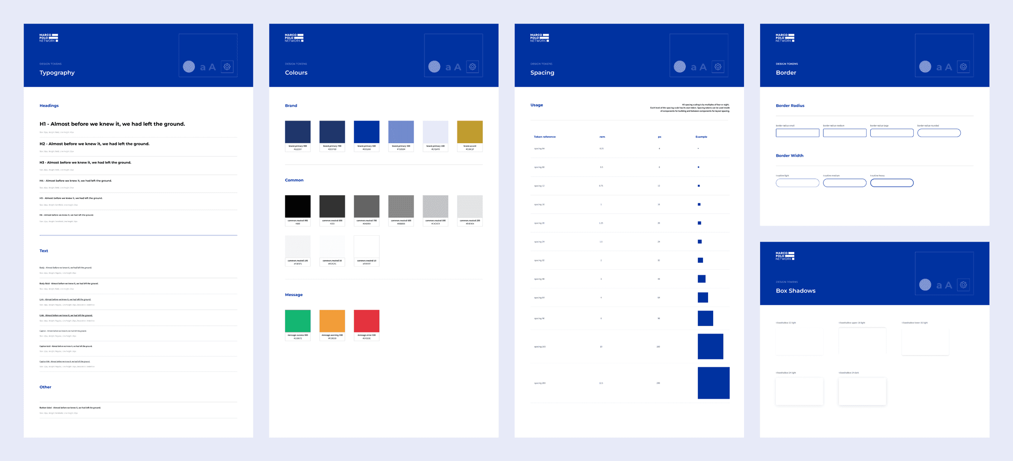
Before moving on to building design elements, we defined the design tokens we needed. We built the tokens based on the brand guideline we had. This is the single source of truth to establish a consistent design language across all modules. At this phase, we defined typography, colours, spacing, borders, shadows etc. To manage the tokens in Figma, we used Tokens Studio for Figma plugin.
Building atoms
Atoms are the smallest building blocks in our system. In our design system, we have buttons, inputs, labels and other small elements that get used throughout our design. Iconography fits in this category too as they’re small elements that come together to form the next stage – molecules.

We also worked extensively on how to manage variants. We found keeping the variants control accessible always helpful while using the components.

Creating molecules
In the molecule stage, we take our independent atomic design elements, each with their own characteristics, style, and format, and begin to bring them together into new groupings. Each atom has carried its unique properties into a group that on its own has distinct characteristics.
We can combine the same atoms in different ways to create unique molecules for use in our design. Though at this stage the groupings are still relatively simple collections.

Create templates
A template is where we begin to curate our organisms and other elements into a cohesive design. Think of templates as the blueprint for our future finished page designs. At this point, they’re still the elements, and won’t contain real data.

Redesigning existing features
At this stage, we started designing pages using the new design system components and defined templates. Initially, we started with the most common pages like Ledger, Ledger details, Payments, Program configuration etc
Create funding request
Funding flow is one of the core functional features in the Payment Commitment (PC) & Receivables Discounting (RD) business module. This flow is widely used by banks, and suppliers and we have this flow validated with customers 6 months earlier. We aimed to redesign the flow with minimum deviation so that customers can go with their known experience.


Screens: Create Funding Request
Conclusion
We believe building a design system is a never-ending process. We have to keep updating the system as we go. Sometimes components might need extra controls, sometimes we find some controls are not necessary. But keeping the system updated and maintaining an agreed protocol is more important.
From our experience with the old system, we understood the impact of improving product consistency. However, the overwhelming feedback from designers exceeded our expectations. It not only streamlined the creation of Hi-Fi designs, freeing up valuable time for problem-solving and ideation but also revolutionized collaboration with engineers—eliminating persistent challenges and enabling a more seamless and efficient workflow.
