Ooredoo Business Portal: Bills & Payments Redesign
Reducing payment friction for 30,000+ corporate customers.
Ooredoo's B2B billing portal was losing 6.3% of active users quarterly due to fragmented billing views, manual payment processes, and lack of visibility across multiple accounts. Corporate customers managing 50+ accounts were forced to pay each one individually, driving them to abandon digital flows entirely in favor of manual bank transfers.
I led the complete redesign of the billing and payment experience, enabling multi-account management, consolidated billing visibility, and batch payment processing. The redesign addressed critical enterprise needs while maintaining usability for SMB customers across web, tablet, and mobile platforms.
My Role & team
Senior UX Designer (me), 2 UX Designers, CX Manager, Product Manager, 2 Engineers, Customer Success Lead
Results
9% increase in digital payment adoption
26% reduction in support tickets related to billing inquiries
Won the "Best Digital Transformation – Corporate" award 2025
Timeline
Dec 2024 - Mar 2025 | 4 months

Driving Factors for a Revamp
Despite B2B services being a key driver of revenue growth in 2023, the Ooredoo Business portal experienced a 6.3% user decline in Q1–Q2 2024, driven by confusing billing, frequent disputes, and high support ticket volumes.
The core issue
Corporate customers managing multiple accounts couldn't understand what they owed or pay efficiently. Bills were fragmented, payment required manual bank transfers, and there was zero visibility into service subscriptions across accounts.
Business stakes
B2B services drove 34% of Ooredoo's 2023 revenue growth. Losing customers here meant losing high-value enterprise contracts.

Old portal view
My Role & Approach
I led the design team and owned the end-to-end experience from research through validation. Working remotely, I directed two designers, facilitated stakeholder alignment, and made final design decisions while balancing six competing user segments (enterprise finance teams, SMBs, admins, support staff) and navigating significant technical constraints.
My specific contributions:
Led and conducted heuristic evaluation identifying 12 critical usability failures
Facilitated 8 stakeholder alignment sessions to prioritize features by business impact
Designed and art-directed complete flows for billing overview, payment, and service management
Directed my team on component design, responsive patterns, and interaction states
Led usability testing preparation and synthesis (testing executed by team designers on-site)
Advocated for preserving bank transfer workflows despite pressure for digital-only payments
I prepared major screens collaboratively with both designers to establish foundational patterns and information architecture. Once aligned, I delegated flow ownership—one designer owned billing dashboard and account views, the other handled service management and history—while I maintained oversight of interaction patterns and cross-flow consistency. Daily syncs resolved design decisions; weekly stakeholder reviews presented our unified direction.
Key strategic challenge
Analytics showed 100% of customers managing 100+ accounts relied on bank transfers—our highest revenue segment. The business wanted to eliminate this entirely. I pushed back, arguing we'd risk alienating our most valuable customers. Instead, I designed a hybrid approach that optimized bank transfers while nudging toward digital for smaller customers. However, technical limitations forced us to separate these into distinct payment touchpoints rather than a unified flow.
Research: Finding the Real Problems
I led research strategy and directed the team through three parallel tracks, personally conducting evaluation and synthesis:
1. Heuristic Evaluation
I systematically evaluated the existing portal against Nielsen's usability principles, documenting 12 critical failures including:
Cluttered dashboard, hiding key details
Key data off-screen increases cognitive load, slows tasks, and raises the risk of missed or incorrect actions
Inconsistent visuals and failure to meet accessibility standards
Unconventional feature names and wrong affordances that don’t match users’ mental models
This evaluation became the artifact that convinced stakeholders we needed a full revamp, not incremental fixes.

Shots: Heuristics evaluation highlights
2. Data Analysis
I analyzed 12 months of Hotjar session recordings and Phoenix Analytics, identifying behavioral patterns:
67% of customers carried past-due balances (friction was causing late payments)
41% still used manual bank transfers (the digital flow was failing)
Users spent avg. 4.2 minutes just finding which accounts had outstanding bills

Critical finding
Users couldn't pay for multiple accounts in one transaction—they had to process each account individually, creating massive friction for customers managing 50+ accounts
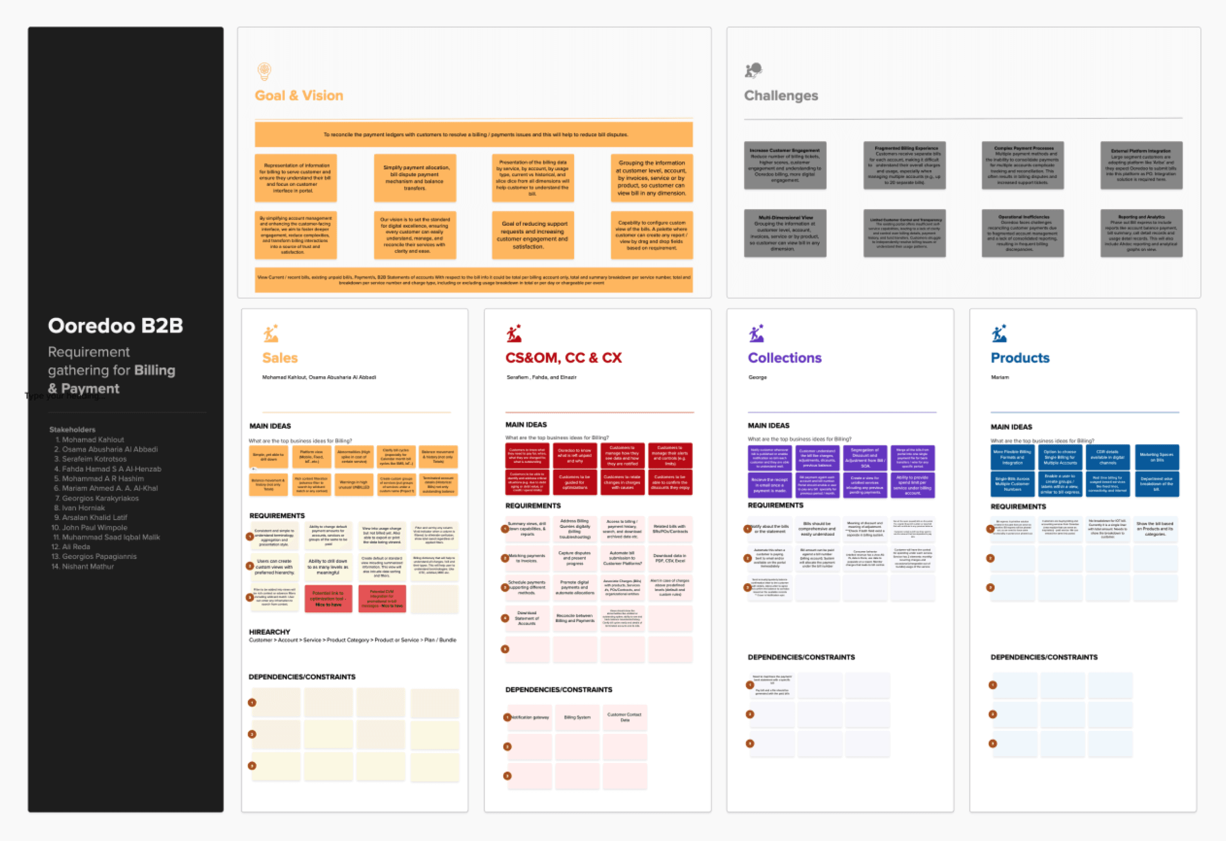
Stakeholder workshop highlights
3. Competitive Benchmarking
Since we couldn't access direct competitors' portals, I analyzed 8 adjacent B2B payment platforms (Stripe Dashboard, AWS Billing, Salesforce Billing) to identify industry patterns around multi-account management, payment orchestration, and financial reconciliation.

Benchmarking report
AI-Powered Deep Dive
I used ChatGPT and FigJam AI to accelerate synthesis of stakeholder notes, analytics, and benchmarking findings into user personas, journey maps, and feature prioritization matrix. This cut my synthesis time by 35%—instead of spending 2 days organizing notes manually, I spent 4 hours on AI-assisted drafts, then 1 day validating and refining them with the team. The time savings let us move faster to design exploration while maintaining research rigor.
AI-driven process accelerated stakeholder-ready artifacts by 35%.

Persona, customer journey map, and feature prioritization matrix
Key insight that shaped everything
Users needed consolidated visibility first, simplified payments second. Most were struggling just to understand their current state across accounts before they even attempted payment. And critically, they needed to pay for multiple accounts in a single transaction.
Design Strategy: Three Core Principles
Based on research, I established three non-negotiable design principles that guided our team:
Consolidated visibility over distributed complexity
Show total outstanding across all accounts immediately, with clear urgency indicators for past-due amounts. Design for users managing 10+ accounts, not single-account scenarios.
Preserve familiar workflows while optimizing them
Don't force behavior change on enterprise customers—improve what they already do.
Progressive disclosure for different user sophistication
SMBs need simplicity; enterprise finance teams need depth and control.
Solution: Key Design Decisions
I'll walk through three critical areas where design directly addressed user pain and business goals:
1. Unified Billing Dashboard: Seeing the Full Picture
The problem
Customers couldn't see total exposure across accounts. They'd discover past-due amounts only when receiving disconnect notices.
My design decision
I sketched initial concept and IA, directed one designer on visual treatments, refined final hierarchy and typography decisions. Created a consolidated dashboard showing:
Total outstanding across all accounts combined
Past-due amount (visually distinct, urgent treatment)
6-month usage trend sparkline for at-a-glance insights
Immediate "Pay Now" path for any amount
Why this mattered
In testing, 100% of users immediately understood their financial position—before the redesign, only 34% could answer "how much do I owe across all accounts?" without clicking through 3+ pages.

Screen: Billing overview
2. Multi-Account Payment Flow: From Sequential to Batch
The problem
Customers could only pay one account at a time. For users managing 50+ accounts, this meant 50 separate payment transactions. Enterprise customers abandoned the digital flow entirely, resorting to bulk bank transfers and manual reconciliation.
My design decision
I restructured the entire payment journey to enable batch operations:
Select multiple accounts (multi-select with search/filter for quick discovery)
Review and adjust amounts (ability to pay partial amounts per account)
Route to appropriate payment method (digital payment OR bank transfer based on user choice)
Shared selection and review experience across both paths for consistency
The technical constraint
Due to backend limitations, I couldn't create a unified payment flow. Instead, I designed two separate touchpoints:
Digital payment path: Integrated checkout for credit card/digital wallet
Bank transfer path: Generates consolidated payment reference and instructions
While not ideal, I ensured both paths shared the same account selection and review experience, maintaining consistency in the critical first two steps.
Why this mattered
We eliminated the sequential payment trap. Users could now select 20 accounts and complete payment in one transaction rather than 20 separate ones. In testing, this became the most celebrated feature—users called it "finally understanding how businesses actually work."


Screen: Account view
3. Service View: Understanding What You're Paying For
The problem
Customers couldn't see which services were tied to which accounts. When bills seemed high, they had no way to investigate without calling support.
My design decision
Created a searchable service catalog showing:
All subscribed services displayed across accounts
Product names instead of confusing service codes
3-level hierarchy: Account → Service Type → Individual Services
Expandable rows with accordion for detail-on-demand
Advanced filters: by account, by service type, by billing frequency
Why this mattered
In testing, the Service View became the #1 engagement point—89% of users navigated here first. It became their source of truth for understanding billing.
Unrealized opportunity
Users wanted to pay directly from this view. I designed the flow, but technical constraints blocked implementation. I documented this as "deferred to Phase 2" and made sure the architecture supported future integration—the table design includes a "select for payment" paradigm that's currently dormant.


Screen: Products and services
Responsive Design: Mobile-First for SMBs
I directed the responsive strategy knowing that 41% of SMB customers accessed the portal via mobile. I established principles for how our desktop patterns should transform for mobile contexts.
Key decisions:
Transformed data tables into card-based layouts on mobile
Prioritized "total due" and "pay now" above the fold
Made search and filters bottom-sheet modals (thumb-friendly)
Used 44px minimum touch targets (Apple HIG standard)
Design artifacts

Screens: Responsive mobile views
Validation: Testing with Real Customers
Working remotely, I led the usability testing strategy and synthesis while my team designers conducted on-site sessions with 9 customers (3 remote, 6 in-person) across enterprise and SMB segments. I briefed the design team on key observation focus areas and probing questions, reviewed session recordings daily while leading synthesis sessions, and presented findings along with design implications to stakeholders.
4
Key user journeys
10+
Iterations for all journeys
8
Client walkthrough sessions
What worked:
100% successfully navigated to billing overview
89% completed payment amount editing
73% overall task completion rate
Service View emerged as highest engagement area (unexpected)
Multi-account selection was immediately understood by enterprise users
What failed:
100% successfully navigated to billing overview
89% completed payment amount editing
73% overall task completion rate
Service View emerged as highest engagement area (unexpected)
Multi-account selection was immediately understood by enterprise users
How I responded:
I advocated for immediate fixes to terminology and filter UI, but faced pushback from finance team who wanted "technical accuracy." I negotiated a compromise: simpler primary labels ("One-time Charge" not "OTC") with technical terms in tooltips for power users. This satisfied both user needs and stakeholder concerns.
I also redesigned the filter interaction from icon-triggered modal to a persistent filter bar—less "clean" visually but 40% more discoverable in follow-up testing.
Results & Impact
🏆 Won "Best Digital Transformation – Corporate" award at the 9th Qatar Digital Business Awards 2025
26%
Reduction in support tickets
3.9%
Increased user engagement
9%
Increase in digital payment
Measured Outcomes (Q3 2025 Post-Launch)
26% reduction in support tickets related to billing inquiries (vs Q1 2024 baseline)
9% increase in digital payment adoption among SMB segment
User engagement reversed: from -6.3% decline to +2.8% growth
58% of digital transactions now use multi-account payment feature
Leadership impact
Directed 2 designers to deliver 6 complete flows across 3 platforms in 6 months
Established design system patterns for multi-select tables now used across portal
Created testing framework now adopted for other portal features
What I Learned
Leading remotely required clear ownership, regular syncs, and transparent communication to keep teams aligned. Despite technical constraints, I focused on maintaining consistency and designing strategically around limitations. Structured testing protocols and daily synthesis improved rigor, while stakeholder collaboration emphasized progress over perfection through practical compromises.
