Back
Elevating the Nojoom rewards journey
Reward Point
Mobile App
The reward points experience was confusing due to a separate Nojoom profile, unclear offers, an unfriendly QR scan process, and a complex voucher and redemption flow. The interface was inconsistent and not easy to use, leading to low engagement.
We unified the user and Nojoom profiles, simplified the redemption flow, improved offer clarity, and redesigned the voucher and QR features for ease of use and improved the interface for a smoother, more engaging experience.

Started with motivation
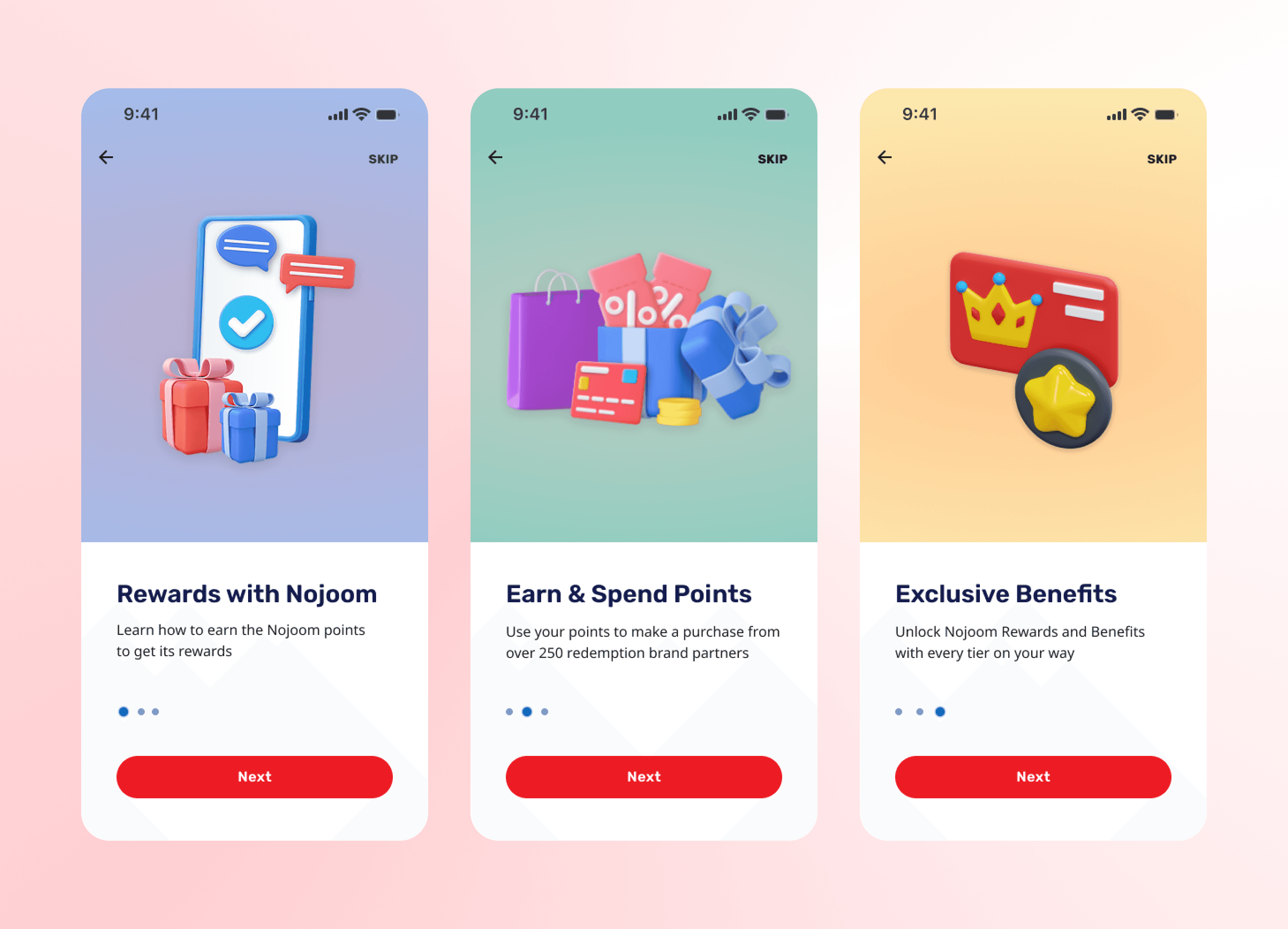
We introduced an optional welcome flow to motivate users by highlighting Nojoom benefits and enhancing first-time engagement.
Goal driven overview
We addressed user confusion around reward point details by introducing a clear milestone view and quick access to key touchpoints, encouraging engagement and simplifying the overall journey.

Redeem points
We optimized the layout by highlighting popular partner vouchers and strategically promoting credit recharge and bill payment options, ensuring quick and easy access in a compact, user-friendly view.

Earn points
We redesigned the earn-points journey to highlight how users collect Nojoom points via Ooredoo and 250+ partners. The new interface simplifies earning rules and tiers, making benefits easier to understand and encouraging frequent engagement.
